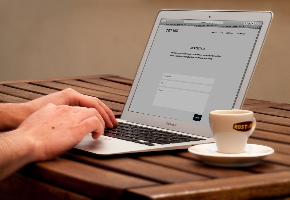
Accessible Web Design: Designing for All Users

Photo by Lisa Fotios

The internet has become an integral part of our daily lives, providing information, services, and entertainment to people all around the world. However, not everyone accesses the web in the same way. For individuals with disabilities, navigating websites can be a significant challenge if those sites are not designed with accessibility in mind. In this 2000-word article, we will explore the importance of accessible web design and provide practical guidance on how to create web content that is inclusive and user-friendly for all individuals, regardless of their abilities.

Understanding Accessibility in Web Design

Web accessibility refers to the practice of making websites and web content usable by individuals with disabilities. It is about ensuring that everyone can perceive, understand, navigate, and interact with the web, regardless of their physical or cognitive abilities. Accessibility is not only a legal requirement in many countries but also a fundamental aspect of good web design.

Types of Disabilities to Consider

When designing for accessibility, it’s essential to consider a wide range of disabilities, including but not limited to:

  1. Visual Impairments: This includes individuals who are blind, have low vision, or are colorblind.
  2. Hearing Impairments: People who are deaf or hard of hearing need alternatives to audio content.
  3. Motor Impairments: Those with limited motor skills may use alternative input devices or voice recognition software.
  4. Cognitive Disabilities: This category covers individuals with intellectual and learning disabilities, who may benefit from simplified content and clear navigation.
  5. Neurological Disabilities: Conditions like epilepsy can be triggered by certain types of web content, so care must be taken to avoid such triggers.
  6. Sensory Impairments: Some individuals may have limited or no ability to perceive touch or temperature and need alternative ways to interact with websites.

The Importance of Accessible Web Design

Creating an accessible website is not just about compliance with legal standards, such as the Americans with Disabilities Act (ADA) in the United States or the Web Content Accessibility Guidelines (WCAG) set by the World Wide Web Consortium (W3C). Accessible web design offers a multitude of benefits, including:

1. Inclusivity

Accessible websites ensure that people with disabilities can access the same information and services as everyone else. This fosters inclusivity and promotes equal opportunities.

2. Expanded Audience

By making your website accessible, you expand your potential audience. People with disabilities constitute a significant portion of the population, and they, too, are potential users or customers.

3. Improved SEO

Many accessibility practices align with good search engine optimization (SEO). For example, using descriptive alt text for images benefits both screen reader users and search engines.

4. Legal Compliance

As mentioned earlier, accessibility is legally mandated in many countries, and non-compliance can result in legal consequences.

5. Enhanced Reputation

Creating an accessible website can boost your organization’s reputation as socially responsible and considerate of all users.

Key Principles of Accessible Web Design

Creating an accessible website involves adhering to several key principles. The Web Content Accessibility Guidelines (WCAG) offer a comprehensive framework for designing accessible web content. These guidelines are organized into four main principles:

1. Perceivable

This principle focuses on ensuring that all information and user interface components are presented in a way that can be perceived by all users, regardless of their abilities. Key guidelines include:

  • Providing text alternatives for non-text content (e.g., alt text for images).
  • Offering captions and transcripts for multimedia content.
  • Making content adaptable, allowing users to adjust it according to their preferences (e.g., text size).
  • Using distinguishable colors and text for clarity and legibility.

2. Operable

The operable principle addresses the functionality and ease of use of a website. It involves providing navigation and interactive elements that can be operated by users with various abilities. Key guidelines include:

  • Keyboard accessibility, ensuring that all functionality can be operated using a keyboard alone.
  • Providing sufficient time for users to read and interact with content.
  • Avoiding content that may cause seizures or physical discomfort.
  • Navigational consistency to make it easy for users to predict the location of content and controls.

3. Understandable

This principle focuses on ensuring that web content is clear and easy for all users to understand. Key guidelines include:

  • Creating text that is readable and understandable.
  • Providing consistent navigation and organization.
  • Using input assistance, such as error identification and labeling for form fields.
  • Offering plain language and providing supplementary explanations for complex content.

4. Robust

The robust principle addresses the need for web content to work reliably with current and future technologies, including assistive technologies. Key guidelines include:

  • Ensuring compatibility with various web browsers and assistive technologies.
  • Using valid code that follows web standards.
  • Providing metadata and proper structure for content, so it can be correctly interpreted by a wide range of user agents.

Practical Techniques for Accessible Web Design

In addition to understanding the principles, it’s crucial to implement practical techniques to make your website accessible. Here are some key techniques:

1. Alt Text for Images

Every image on your website should have descriptive alternative text (alt text). Alt text is essential for users who are blind or have low vision as it conveys the content and function of the image. When writing alt text:

  • Be concise and descriptive.
  • Avoid using phrases like “image of” or “picture of.”
  • Include essential details about the image.

2. Semantic HTML

Use semantic HTML elements to structure your content. HTML tags like headings (h1, h2, h3, etc.), lists, and tables provide a clear structure that helps all users understand the content. For example:

  • Use heading tags in the correct order (h1 for the main title, h2 for subheadings, and so on).
  • Use lists for lists (ul for unordered lists, ol for ordered lists).
  • Use table elements for tabular data.

3. Keyboard Accessibility

Ensure that all interactive elements can be navigated and operated using a keyboard. Test your website by navigating through it using the “Tab” key and using the “Enter” key to activate links and buttons. Avoid using elements that can’t be accessed via a keyboard alone.

4. Video and Audio Accessibility

When embedding multimedia content, provide captions and transcripts. Captions help individuals with hearing impairments, while transcripts allow everyone to access the content. Additionally, ensure that video players have accessible controls, making it easier for users to play, pause, and adjust the volume.

5. Forms and Inputs

Forms are a common part of web interaction, and it’s crucial to ensure they are accessible. Key considerations include:

  • Using labels for form fields, so screen reader users can understand the purpose of each field.
  • Offering error messages and suggestions for completing forms accurately.
  • Ensuring that interactive elements have focus states (visible outlines) for keyboard navigation.

6. Color and Contrast

Consider color choices and contrast to ensure that text and interactive elements are legible for all users. Avoid relying on color alone to convey information. Key points include:

  • Ensuring a sufficient color contrast between text and its background.
  • Providing alternative cues (beyond color) for conveying information or indicating errors.

7. Testing with Assistive Technologies

To truly understand how users with disabilities experience your website, it’s essential to test it with assistive technologies. These may include screen readers, voice recognition software, and keyboard navigation. Testing with real users is invaluable for identifying issues and making necessary improvements.

Tools and Resources for Accessibility

Several tools and resources are available to help web designers and developers create accessible websites. Here are some of the most useful ones:

  1. WAVE Web Accessibility Evaluation Tool: WAVE is a free browser extension that provides in-page accessibility feedback and allows you to see your web content as it is read by assistive technologies.
  2. WCAG (Web Content Accessibility Guidelines): The official WCAG website offers comprehensive guidance, techniques, and examples for designing accessible web content.
  3. A11Y Project: This project provides resources, tools, and a checklist to help you understand and implement web accessibility.
  4. Color Contrast Checkers: Tools like the WebAIM Color Contrast Checker allow you to check the contrast of your text against background colors to ensure readability.
  5. Screen Readers: Familiarize yourself with screen readers like JAWS, NVDA, and VoiceOver to test how your website is experienced by users with visual impairments.
  6. HTML Validators: Tools like the W3C Markup Validation Service can help ensure your HTML code is well-structured and follows web standards.
  7. Keyboard Navigation: Test your website using only a keyboard for navigation, as this is a common way for people with mobility issues to interact with web content.

The Role of Web Accessibility Testing

Testing for web accessibility is an ongoing process. It involves evaluating your website for compliance with accessibility guidelines, identifying issues, and implementing necessary improvements. The testing process includes:

  1. Manual Testing: Manually go through your website, using keyboard navigation and screen readers to identify issues. Pay attention to keyboard focus, alt text for images, and the logical structure of the page.
  2. Automated Testing: Utilize accessibility testing tools like WAVE or Axe to scan your website for common issues. While these tools are valuable, they may not catch all accessibility problems, so manual testing is essential.
  3. User Testing: Engage users with disabilities to test your website. This real-world feedback is invaluable for uncovering issues that may not be apparent through automated testing.
  4. Regular Audits: Regularly audit your website for accessibility to ensure that new content and updates maintain compliance with accessibility standards.

Conclusion

Web accessibility is not just a legal requirement; it’s a moral and ethical obligation. Designing for all users, regardless of their abilities, is at the core of creating an inclusive online environment. By following the principles and techniques of accessible web design, you can ensure that your website is user-friendly for everyone. Remember that accessibility is not a one-time task; it’s an ongoing commitment to making the web a more inclusive and welcoming place for all. As web designers and developers, it is our responsibility to ensure that the digital world is accessible to everyone, without exception.

Generated by ChatGPT

Optimizing Website Performance: Speed and Efficiency

Photo by Pixabay

In today’s fast-paced digital landscape, where users demand instant access to information and seamless browsing experiences, website performance optimization is paramount. A slow and inefficient website not only frustrates visitors but can also have detrimental effects on your business, from higher bounce rates to lower search engine rankings. In this article, we’ll explore the importance of website speed and efficiency and provide practical tips for optimizing your website’s performance.

The Significance of Website Performance

1. User Experience

One of the most critical aspects of website performance is its impact on user experience. Users have become increasingly impatient, and a delay of just a few seconds in page load time can lead to frustration and abandonment. According to research by Google, if a website takes more than three seconds to load, 53% of mobile users will leave. This is a significant loss in potential traffic and revenue.

A slow website can also result in a poor user experience, with visitors struggling to navigate and access content. This negative experience can tarnish your brand’s reputation and deter users from returning in the future.

2. Search Engine Ranking

Website performance is a crucial factor in search engine optimization (SEO). Search engines like Google consider page speed as one of the ranking factors. Faster websites tend to rank higher in search results, making it more likely for users to discover your site. Improved rankings can translate into increased organic traffic and visibility.

3. Conversion Rates

Website performance has a direct impact on conversion rates. Studies have shown that faster-loading pages have higher conversion rates. When your website loads quickly, visitors are more likely to engage with your content, make purchases, or take other desired actions. Conversely, slow websites can lead to higher bounce rates and lower conversion rates.

4. Mobile Responsiveness

As mobile devices continue to dominate internet usage, optimizing website performance for mobile users is essential. Mobile users often have slower internet connections and limited processing power compared to desktop users. Ensuring your website is fast and efficient on mobile devices is crucial for reaching a broader audience and providing an excellent user experience.

Key Metrics for Website Performance

To effectively optimize website performance, it’s essential to measure and monitor various performance metrics. Here are some key metrics to consider:

1. Page Load Time

Page load time is the time it takes for a web page to fully load in a user’s browser. This metric is critical because it directly impacts user experience and SEO rankings. Aim for a page load time of under three seconds for optimal results.

2. Time to First Byte (TTFB)

TTFB measures the time it takes for a user’s browser to receive the first byte of data from the web server. A fast TTFB indicates that the server is responding quickly, while a slow TTFB suggests server-related issues.

3. Page Size

The size of your web pages, including all the assets (images, scripts, stylesheets, etc.), affects loading times. Smaller page sizes generally load faster. Compressing images and minimizing code can help reduce page size.

4. Number of Requests

Each element on a web page, such as images, scripts, and stylesheets, requires a separate HTTP request. Minimizing the number of requests can significantly improve loading times. Combining and optimizing assets can help reduce the number of requests.

5. Mobile Performance

Don’t forget to assess your website’s performance on mobile devices. Mobile performance metrics may include mobile page load times, usability on small screens, and touch responsiveness.

Practical Tips for Optimizing Website Performance

Now that we understand the importance of website performance and the key metrics to monitor, let’s explore practical tips to optimize your website’s speed and efficiency.

1. Choose a Fast Hosting Provider

Your choice of web hosting has a substantial impact on website performance. Opt for a reputable hosting provider that offers high-speed servers and reliable uptime. Consider using Content Delivery Networks (CDNs) to distribute content geographically and reduce server load times.

2. Optimize Images and Media

Images and media files are often the largest contributors to page size. Compress images, use modern image formats like WebP, and implement lazy loading to ensure that images load only when they come into the user’s viewport. Additionally, consider responsive images that adapt to different screen sizes and resolutions.

3. Minimize HTTP Requests

Reducing the number of HTTP requests is crucial for faster loading times. Combine multiple CSS and JavaScript files into one, and use asynchronous loading for non-essential scripts. Minimize the use of external scripts and third-party integrations that can slow down your website.

4. Enable Browser Caching

Leverage browser caching to store static assets like images, stylesheets, and scripts on a user’s device. When a user revisits your website, these assets can load from the local cache instead of being fetched from the server, leading to faster page loads.

5. Use Content Delivery Networks (CDNs)

CDNs distribute your website’s content across multiple servers in different geographic locations. This reduces the physical distance between the server and the user, resulting in faster loading times. Popular CDNs include Cloudflare, Amazon CloudFront, and Akamai.

6. Minimize Code and Use Efficient Scripts

Clean and efficient code can significantly improve website performance. Remove unnecessary code, whitespace, and comments. Optimize your CSS and JavaScript to reduce file sizes. Consider using server-side rendering for dynamic content to reduce client-side processing.

7. Implement GZIP Compression

Enable GZIP compression on your server to reduce the size of HTML, CSS, and JavaScript files before they are sent to the user’s browser. This can lead to substantial reductions in page load times.

8. Prioritize Above-the-Fold Content

Load critical content, such as text and images, that appears above the fold (initial visible area) of the page first. This gives users the perception of a faster-loading website, even if some non-essential elements load later.

9. Monitor and Test Performance Regularly

Website performance is not a one-time task but an ongoing effort. Use tools like Google PageSpeed Insights, GTmetrix, and WebPageTest to regularly analyze and test your website’s performance. Address any issues or bottlenecks promptly.

10. Consider Progressive Web Apps (PWAs)

Progressive Web Apps combine the best of web and mobile apps, offering fast loading times, offline capabilities, and a seamless user experience. Consider building a PWA if it aligns with your website’s goals.

11. Optimize for Mobile

Given the prevalence of mobile browsing, ensure that your website is responsive and optimized for mobile devices. Use responsive design techniques and test your site on various mobile devices to ensure a smooth user experience.

12. Reduce Third-Party Scripts and Plugins

While third-party scripts and plugins can add functionality to your website, they can also introduce performance bottlenecks. Limit the use of third-party integrations and choose lightweight alternatives when possible.

Optimizing website performance is not a luxury but a necessity in today’s digital landscape. A fast and efficient website not only enhances user experience but also improves search engine rankings and conversion rates. By focusing on key metrics, choosing the right hosting provider, optimizing assets, and following best practices, you can ensure that your website delivers the speed and efficiency that users expect. Remember that website performance optimization is an ongoing process, and regular monitoring and improvements are essential to stay ahead of the competition and keep your users happy.

Generated by ChatGPT

The Power of Visuals: Using Images and Videos in Web Design

Photo by Bich Tran

In the ever-evolving landscape of web design, the importance of visuals cannot be overstated. Images and videos are not just decorative elements; they are powerful tools that can significantly impact user engagement, convey information effectively, and create memorable experiences. In this article, we will delve into the profound influence of visuals in web design and explore how to leverage them effectively to enhance your website’s appeal and functionality.

The Visual Web: A New Paradigm

The internet has come a long way from its text-based origins. Today, it is a visual medium where aesthetics and user experience play pivotal roles. Visuals are the first thing visitors notice when they land on a website. They instantly convey the website’s identity, message, and purpose. Here’s why visuals matter so much in the digital realm:

1. Immediate Impact

The human brain processes visuals 60,000 times faster than text. This means that your website has just a fraction of a second to make a positive impression on visitors. A visually appealing design can capture their attention and encourage them to explore further.

2. Enhanced Communication

Visuals are a universal language. They can communicate complex ideas and emotions without the need for words. Whether it’s a powerful image, an informative chart, or an engaging video, visuals can convey information more effectively than text alone.

3. Increased Engagement

Engagement is the lifeblood of any website. Visual content, such as high-quality images and engaging videos, can keep visitors on your site for longer periods. This increased dwell time can lead to higher conversion rates and better search engine rankings.

4. Memorability

People remember visual content better than text. If your website includes memorable visuals, visitors are more likely to remember your brand and return in the future.

5. Differentiation

In a crowded online landscape, it’s essential to stand out. Thoughtful use of visuals can differentiate your website from competitors, making it more memorable and unique.

Now that we understand why visuals matter, let’s explore how to harness their power in web design.

The Role of Images in Web Design

Images are a fundamental component of web design. They can serve various purposes, from setting the tone and mood to conveying information and guiding user attention. Here’s how to make the most of images in your web design:

1. High-Quality Imagery

Quality matters. Use high-resolution images that are sharp and clear. Grainy or pixelated images can make your website appear unprofessional. Invest in quality photography or use reputable stock photo websites for your visuals.

2. Relevance and Purpose

Every image on your website should have a purpose. Ask yourself what each image is meant to convey or achieve. Avoid using visuals just for the sake of decoration; they should support your content and message.

3. Consistency

Maintain consistency in your image style throughout your website. Consistency in color schemes, image styles, and proportions creates a cohesive visual identity and enhances user experience.

4. Optimization

Optimize your images for the web to ensure fast loading times. Large image files can slow down your site and lead to a poor user experience. Use image compression tools to strike a balance between quality and file size.

5. Accessibility

Ensure that your images are accessible to all users, including those with disabilities. Use alt text to describe images, making it easier for screen readers to convey the content to visually impaired users.

6. Responsive Design

Design your website with responsiveness in mind. Images should adapt to various screen sizes and orientations, ensuring a seamless experience for users on different devices.

7. Hero Images

Consider using hero images or banners at the top of your webpages to create a strong visual impression. These images should represent the essence of your content or brand.

8. Image Galleries

For businesses or portfolios, image galleries can be a powerful way to showcase your work or products. Implement intuitive navigation and make it easy for users to view and interact with the images.

The Influence of Videos in Web Design

While images are essential, videos take web design to the next level. They offer a dynamic and interactive experience that can captivate and inform your audience. Here’s how to effectively use videos in your web design:

1. Homepage Videos

A video on your homepage can quickly convey your brand’s story, products, or services. Use concise and engaging videos that auto-play (with sound muted) to grab visitors’ attention without overwhelming them.

2. Tutorials and How-Tos

Videos are an excellent way to provide tutorials or step-by-step guides. Whether you’re showcasing a product’s features or explaining a complex concept, videos make learning easier and more engaging.

3. Testimonials and Case Studies

Videos featuring satisfied customers or in-depth case studies can build trust and credibility. Hearing real people share their positive experiences with your product or service is incredibly persuasive.

4. Background Videos

Background videos can create a captivating visual backdrop for your website. Use them sparingly and ensure that they don’t distract from the main content.

5. Video Headers

Video headers are becoming increasingly popular in web design. They offer a dynamic and attention-grabbing introduction to your website. Make sure the video content is relevant to your brand and message.

6. Video Blogs (Vlogs)

Consider adding a vlog section to your website, where you regularly share video content related to your industry or niche. This can help establish your authority and keep your audience engaged.

7. Interactive Videos

Interactive videos, where viewers can make choices that affect the storyline or outcome, can create an immersive and memorable experience. These are especially effective for storytelling or gamification purposes.

Best Practices for Using Visuals in Web Design

To harness the power of visuals effectively, follow these best practices:

1. Balance and Consistency

Maintain a balance between text and visuals. Too many visuals can overwhelm users, while too much text can make your site appear dull. Consistency in style and tone is key to a cohesive design.

2. Mobile-Friendly Design

Ensure that your visuals are optimized for mobile devices. Mobile users make up a significant portion of web traffic, so it’s crucial to provide them with a seamless experience.

3. Loading Speed

Optimize images and videos for fast loading times. Slow-loading visuals can frustrate users and lead to high bounce rates.

4. Branding

Use visuals that align with your brand identity. Your visuals should reflect your brand’s values, personality, and message.

5. A/B Testing

Experiment with different visuals to see what resonates best with your audience. A/B testing can help you determine which images and videos lead to higher engagement and conversions.

6. Legal Considerations

Be aware of copyright and licensing issues when using visuals. Always use images and videos that you have the rights to or those available under appropriate licenses.

7. User Experience (UX)

Prioritize user experience in your visual design. Ensure that visuals enhance usability and don’t hinder navigation or content consumption.

In the digital age, visuals are the cornerstone of effective web design. They have the power to capture attention, convey information, and create memorable experiences. By incorporating high-quality images and engaging videos into your website, you can enhance user engagement, build brand identity, and differentiate yourself from competitors. Remember to follow best practices for visual design, prioritize accessibility, and continuously test and optimize your visuals to ensure a stellar user experience. In doing so, you can harness the full potential of visuals and elevate your web design to new heights.

Generated by ChatGPT

Crafting Engaging Call-to-Actions on Your Website

Photo by Pixabay

In the digital age, where attention spans are fleeting and competition for online engagement is fierce, the effectiveness of your website’s call-to-action (CTA) can make or break your business’s success. A well-crafted CTA acts as a guide, directing visitors towards a desired action and converting them into valuable leads or customers. Whether it’s signing up for a newsletter, making a purchase, or simply sharing content, mastering the art of creating engaging CTAs is crucial. This article will delve into the key principles and strategies for crafting compelling CTAs that drive meaningful interactions and conversions on your website.

Understanding the Power of a Call-to-Action

Before delving into the strategies for creating engaging CTAs, it’s important to understand why they matter. A CTA serves as a prompt that encourages visitors to take a specific action, aligning their intentions with your business goals. It bridges the gap between passive browsing and active engagement, propelling users to move forward in the customer journey. A strategically placed and well-designed CTA can significantly boost conversion rates, drive sales, and build a loyal customer base.

1. Clarity is Key

An effective CTA leaves no room for confusion. It should convey a clear and concise message about the action you want the user to take. Use actionable and specific language that directly tells users what to do. Instead of a vague “Learn More” button, opt for something like “Get Your Free EBook” or “Start Your 30-Day Trial.” This specificity eliminates any guesswork and ensures that users understand the value they will receive by clicking.

2. Create a Sense of Urgency

Human psychology responds to urgency. By incorporating time-sensitive language in your CTAs, you can drive users to act quickly. Phrases like “Limited Time Offer,” “Only a Few Left,” or “Ending Soon” trigger a fear of missing out (FOMO), compelling users to take action before the opportunity passes. However, it’s essential to maintain honesty in your urgency; false claims can harm your credibility and reputation.

3. Benefit-Oriented Language

People are more likely to engage when they understand the benefits they will gain. Craft your CTAs with language that highlights the value users will receive. Instead of focusing solely on the action (“Sign Up”), emphasize what users will gain (“Unlock Exclusive Access”). Connect the action with the reward, making users more motivated to click.

4. Strategic Placement

Where you place your CTAs can significantly impact their effectiveness. Position them where users’ attention naturally gravitates, such as at the end of informative blog posts, on landing pages, or within the header or footer of your website. Additionally, consider the “F-pattern” reading behavior – users tend to scan content in an F-shaped pattern, so place CTAs where the eyes are likely to land during this scanning process.

5. Design and Visual Hierarchy

The design of your CTA should make it stand out from the rest of your content. Use contrasting colors that complement your website’s color scheme, making the CTA visually appealing and attention-grabbing. Employ whitespace strategically to prevent visual clutter and guide users’ focus to the CTA. Size and placement also play a role; larger buttons tend to attract more clicks, and placing them above the fold ensures visibility without scrolling.

6. Personalization for Relevance

Tailoring your CTAs to specific user segments can significantly enhance their effectiveness. Utilize data from user behavior and preferences to offer personalized CTAs. For instance, if a user has previously shown interest in a particular product category, your CTA could present related products or a discount for that category. Personalization creates a sense of relevance, increasing the likelihood of engagement.

7. A/B Testing and Optimization

Crafting the perfect CTA often involves experimentation. A/B testing is a valuable technique that allows you to compare different versions of CTAs to determine which one performs better. Test variables such as language, color, placement, and size. Analyze the results to refine your CTAs continually. Optimization should be an ongoing process, as user behaviors and preferences evolve over time.

8. Mobile Responsiveness

With the growing prevalence of mobile browsing, ensuring your CTAs are optimized for smaller screens is imperative. Design CTAs that are easy to tap and interact with on mobile devices. Keep the text concise, and ensure that buttons are appropriately sized for touch. A frustrating mobile experience can lead to high bounce rates and missed conversion opportunities.

9. Minimize Friction

The path from clicking a CTA to completing the desired action should be smooth and intuitive. Minimize the number of steps required to fulfill the action. For instance, if you’re offering a free download, don’t ask for extensive information in the signup form. The more friction you remove, the more likely users are to follow through.

10. Trust and Transparency

Establishing trust is paramount in online interactions. Be transparent about what users can expect after clicking a CTA. If the CTA leads to a sign-up form, clearly communicate how often you’ll email them and the type of content they’ll receive. Display trust signals, such as security badges for payment CTAs, to assure users that their information is safe.

Crafting engaging CTAs is both an art and a science. By understanding the psychology of user behavior, leveraging the power of design, and optimizing through testing, you can create CTAs that resonate with your audience and drive meaningful interactions. Remember that successful CTAs align user needs with your business goals while offering clear value and a seamless user experience. As you continue to refine and perfect your CTAs, you’ll discover the immense impact they can have on your website’s success, conversion rates, and overall growth in the digital landscape.

Generated by ChatGPT

Web Design Dos and Don’ts: Common Mistakes to Avoid

Photo by energepic.com

In today’s digital era, having a visually appealing and user-friendly website is crucial for businesses and individuals alike. However, even with the best intentions, it’s easy to make design mistakes that can negatively impact user experience and hinder the effectiveness of your website. In this article, we will explore common web design mistakes and provide practical dos and don’ts to help you avoid them.

Don’t: Overcomplicate the Design

One of the most common mistakes in web design is overcomplicating the layout. Adding excessive visual elements, complex animations, and cluttered content can overwhelm users and make it difficult for them to find what they’re looking for. Instead, strive for simplicity. Focus on clean, organized layouts that prioritize usability and ease of navigation. A clutter-free design allows users to focus on the most important elements of your website and improves overall user experience.

Do: Prioritize Responsive Design

In today’s mobile-dominated world, responsive design is not an option; it’s a necessity. Your website should adapt seamlessly to different screen sizes and devices, ensuring that users have a consistent experience regardless of the platform they’re using. Utilize responsive design principles to optimize the layout, images, and content to fit various screen sizes. A mobile-friendly website is essential for capturing and retaining the attention of a growing number of mobile users.

Don’t: Use Poor Color Combinations

Color is a powerful tool in web design, but it can easily be misused. Using too many colors or clashing color combinations can create a chaotic and unprofessional appearance. Additionally, poor color choices can make text difficult to read, causing usability issues. When selecting colors for your website, consider the psychology behind color choices and aim for a harmonious and visually pleasing palette. Use contrasting colors for text and background to ensure readability and accessibility.

Do: Optimize Loading Speed

In today’s fast-paced world, users expect websites to load quickly. Slow-loading websites not only frustrate visitors but also negatively impact search engine rankings. Optimize your website’s loading speed by optimizing image sizes, minimizing HTTP requests, and leveraging caching techniques. Regularly monitor and test your website’s loading time to identify and resolve any bottlenecks. A fast-loading website enhances user experience, reduces bounce rates, and improves overall conversion rates.

Don’t: Neglect User-Friendly Navigation

Poor navigation is a surefire way to drive users away from your website. Complex menus, hidden links, and confusing navigation structures can leave users feeling frustrated and lost. Avoid using ambiguous labels or burying important information deep within your site. Instead, create a clear and intuitive navigation system that allows users to find what they’re looking for easily. Use descriptive labels and hierarchical structures to guide users and provide a seamless browsing experience.

Do: Focus on Readability and Typography

The readability of your website’s content is paramount. Using small font sizes, illegible typefaces, or inadequate contrast between text and background can strain users’ eyes and discourage them from engaging with your content. Choose legible fonts and font sizes that are easy to read across different devices and screen sizes. Ensure there is sufficient contrast between text and background colors to enhance readability. Pay attention to line spacing and paragraph formatting to create visually appealing and digestible content.

Don’t: Ignore Mobile Optimization

With the increasing use of smartphones and tablets, optimizing your website for mobile devices is no longer optional. Failing to provide a seamless mobile experience can lead to high bounce rates and lost opportunities. Avoid using Flash or other technologies that are not supported on mobile devices. Opt for responsive design, as mentioned earlier, and test your website extensively on various mobile devices and screen sizes. Mobile optimization is crucial for capturing and retaining the attention of a significant portion of your audience.

Do: Incorporate Clear Calls to Action

Effective web design goes beyond aesthetics; it guides users toward specific actions. Clear and compelling calls to action (CTAs) are essential for prompting users to engage with your website and achieve your desired outcomes. Whether it’s signing up for a newsletter, making a purchase, or filling out a contact form, strategically place visually distinct CTAs throughout your website. Use persuasive language and design elements to grab users’ attention and lead them to take the desired action.

Don’t: Neglect Search Engine Optimization (SEO)

A visually stunning website is meaningless if it’s not easily discoverable by search engines. Neglecting search engine optimization (SEO) can result in low organic traffic and poor visibility. Avoid common SEO mistakes such as duplicate content, missing meta tags, and broken links. Optimize your website’s structure, headings, and metadata to improve search engine rankings. Conduct keyword research and incorporate relevant keywords naturally into your content. By prioritizing SEO, you can increase organic traffic and reach a wider audience.

Do: Test, Iterate, and Gather Feedback

Web design is an iterative process. Once your website is live, it’s important to gather feedback and analyze user behavior to identify areas for improvement. Conduct usability testing sessions with real users to uncover potential pain points and usability issues. Utilize web analytics tools to track user engagement, bounce rates, and conversion rates. Based on this feedback, iterate on your design, implement improvements, and continuously optimize your website to provide the best possible user experience.

By avoiding common web design mistakes and adhering to best practices, you can create a visually appealing, user-friendly, and effective website. Prioritize simplicity, responsive design, readability, and user-friendly navigation. Optimize your website’s loading speed, incorporate clear CTAs, and pay attention to SEO. Regularly test, gather feedback, and iterate on your design to ensure your website continually evolves to meet the needs and expectations of your users. With a well-designed website, you can make a lasting impression and achieve your online goals.

Generated by ChatGPT

Streamlining Navigation: Designing Intuitive Websites

Photo by Antoni Shkraba

In today’s digital landscape, where users have countless options at their fingertips, website design plays a crucial role in capturing and retaining the attention of visitors. One of the fundamental elements of an effective website is intuitive navigation. A well-designed navigation system ensures that users can easily find the information they seek, leading to a positive user experience and increased engagement. In this article, we will explore the importance of streamlining navigation and provide practical tips for designing intuitive websites.

Why is intuitive navigation important?

Imagine visiting a website where you struggle to find the information you need. The navigation is confusing, links are buried deep within the site, and the overall user experience is frustrating. Chances are, you would quickly abandon the site and seek an alternative source. This scenario highlights the significance of intuitive navigation.

Intuitive navigation enhances the user experience by minimizing confusion and cognitive load. When users can effortlessly navigate a website, they are more likely to stay longer, explore more content, and convert into customers. On the other hand, poor navigation can lead to high bounce rates, low engagement, and lost opportunities.

So, how can we design intuitive websites that streamline navigation?

1. Clear and Consistent Structure: A logical and consistent structure is the backbone of intuitive navigation. Plan your website’s hierarchy by organizing content into categories and subcategories. Use clear labels that accurately represent the content within each section. A user should be able to predict what they will find when clicking on a navigation link.

2. Minimalism and Simplicity: Keep your navigation design simple and clutter-free. Avoid overwhelming users with an excessive number of options or complex dropdown menus. Stick to the essential navigation links and consider utilizing a “hamburger” menu for mobile devices to conserve screen space. By reducing visual noise, users can focus on the main content and navigate with ease.

3. Visible and Accessible Navigation: Place your navigation in a prominent location on your website, preferably at the top or left-hand side. Users should be able to find it immediately upon landing on your site. Additionally, ensure your navigation is accessible across all devices and screen sizes. Responsive design is essential for providing a seamless experience regardless of the user’s device.

4. Descriptive Link Text: Use clear and descriptive link text that accurately represents the destination page. Instead of generic labels like “Click Here” or “Read More,” provide specific labels that indicate what users can expect to find. For example, instead of “Services,” use “Web Design Services” or “Our Portfolio.”

5. Breadcrumb Navigation: Breadcrumb navigation provides users with a hierarchical trail that shows their current location within the website’s structure. It helps users understand their position and allows them to navigate back easily. Breadcrumbs are particularly useful for websites with deep hierarchies or e-commerce platforms with multiple product categories.

6. Search Functionality: Implement a search bar that enables users to quickly find specific information or products. Integrating a search feature is essential, especially for websites with a large amount of content. Ensure the search bar is prominently placed and easily accessible.

7. User Testing and Feedback: Regularly test your website’s navigation with real users to identify potential pain points and areas for improvement. Collect feedback through surveys or user testing sessions to gain valuable insights into how users interact with your navigation system. Use this feedback to refine and optimize your design over time.

8. Clear Call-to-Action (CTA) Buttons: Effective navigation should lead users to specific actions or conversions. Include clear and visually distinct call-to-action buttons throughout your website to guide users towards the next step. Whether it’s signing up for a newsletter, making a purchase, or contacting you for more information, CTAs help users navigate with purpose.

7. Performance Optimization: Ensure your website’s navigation is optimized for speed and responsiveness. Slow-loading menus or delayed dropdowns can frustrate users and deter them from exploring further. Optimize your website’s performance by compressing images, minifying code, and leveraging caching techniques to deliver a seamless navigation experience.

8. Analytics and Iteration: Monitor and analyze user behavior using website analytics tools to gain insights into how users navigate through your site. Identify areas of high engagement, popular content, and pages with high bounce rates. Use this data to make informed design decisions and iterate on your navigation strategy.

Intuitive navigation is a crucial aspect of designing effective websites. By streamlining navigation and providing a user-friendly experience, you can increase user engagement, reduce bounce rates, and ultimately achieve your website’s goals. Remember to prioritize clear structure, simplicity, and accessibility while incorporating user feedback and analytics into your design process. With these principles in mind, you can create websites that effortlessly guide users and leave a lasting positive impression.

Generated by Chatgpt

The Role of Typography in Web Design: Best Practices

Photo by Lisa Fotios:

When it comes to web design, typography is an essential element that often gets overlooked. Typography refers to the style, arrangement, and appearance of text on a website. It plays a crucial role in shaping the overall user experience and conveying the brand message effectively. In this article, we will explore the role of typography in web design and highlight some best practices to help you create visually appealing and readable websites.

1. Establish readability and legibility

The primary purpose of typography is to ensure that the text on your website is readable and legible. Readability refers to how easily users can comprehend the content, while legibility focuses on the clarity of individual characters. To enhance readability, consider the following:

  • Font choice: Select a font that is easy to read on different screens and sizes. Sans-serif fonts like Arial or Helvetica are commonly used for body text, while serif fonts like Times New Roman or Georgia can add a touch of elegance to headings.
  • Font size: Opt for an appropriate font size that is comfortable to read across various devices. Avoid excessively small text that strains the eyes or oversized text that disrupts the flow of content.
  • Line spacing: Ample line spacing, also known as leading, improves legibility and makes the text more breathable. Avoid overcrowded or tightly packed lines of text.
  • Contrast: Ensure sufficient contrast between the text and the background to make the content easily distinguishable. High contrast enhances readability, especially for users with visual impairments.

2. Establish hierarchy and visual hierarchy

Typography helps establish a visual hierarchy on your website, guiding users through the content and emphasizing important information. Effective hierarchy ensures that users can quickly scan and understand the structure of your webpage. Consider the following techniques:

  • Headings and subheadings: Use varying font sizes, weights, or styles to differentiate headings and subheadings. This helps users quickly identify and navigate different sections of your content.
  • Bold and italics: Use bold or italics to highlight key points, important information, or calls to action within the text. However, use them sparingly to avoid visual clutter.
  • Color: Utilize color to differentiate elements and convey meaning. For example, using a different color for hyperlinks can make them stand out and indicate interactivity.

3. Consistency and branding

Typography plays a crucial role in establishing and maintaining brand identity across your website. Consistency in font choices and styles helps create a cohesive and professional look. Consider the following:

  • Font pairing: Choose font combinations that complement each other and align with your brand’s personality. Pair a decorative or display font for headings with a more legible font for body text.
  • Font styles: Define and consistently use font styles such as font weights (e.g., bold, regular, light), font sizes, and font colors. This ensures a unified visual experience across different pages of your website.
  • Brand-specific fonts: If your brand has a specific font associated with it, consider using it in your web design to reinforce brand recognition and strengthen the overall brand identity.

4. Responsive design considerations

In the era of mobile devices, responsive web design is crucial to provide an optimal user experience across different screen sizes. Typography should adapt seamlessly to different devices and resolutions. Consider the following:

  • Fluid typography: Use relative units like percentages or ems instead of fixed pixel values for font sizes. This allows the text to scale proportionally with the screen size.
  • Breakpoints: Define specific font sizes or styles for different screen sizes using media queries. This ensures that the text remains readable and visually appealing across various devices.

5. Test and optimize


Lastly, testing and optimization are essential steps in ensuring that your typography choices work well for your target audience. Conduct user testing and gather feedback to identify any readability issues or areas for improvement. Pay attention to how users navigate and interact with the text on your website. Consider factors such as reading speed, comprehension, and overall user satisfaction. Based on the feedback received, make necessary adjustments to typography choices, font sizes, or styles to optimize the user experience.

Typography is a critical aspect of web design that should not be overlooked. By following best practices for typography, you can create a visually appealing, readable, and engaging website. Focus on establishing readability and legibility, creating a clear hierarchy, maintaining consistency with your brand, considering responsive design, and testing and optimizing for the best user experience. Remember that typography is not just about selecting fonts; it’s about using them strategically to enhance the overall design and effectively communicate your brand’s message. With careful attention to typography, you can elevate your web design and leave a lasting impression on your website visitors.

Generated by Chat GPT

Choosing the Right Color Palette for Your Website

Photo by Caio

When it comes to designing a website, color plays a vital role in creating a visually appealing and engaging user experience. The right color palette can convey your brand’s personality, evoke emotions, and improve overall usability. However, selecting the perfect color scheme can be a daunting task. In this article, we will explore some key considerations to help you choose the right color palette for your website.

1. Understand your brand and target audience

Before diving into color selection, it is crucial to have a clear understanding of your brand identity and target audience. Consider the values, mission, and personality of your brand. Are you aiming for a professional, corporate look or a playful and vibrant atmosphere? Understanding your target audience will also influence your color choices. Different age groups, cultures, and industries may respond differently to colors. For example, vibrant and bold colors may appeal to a younger audience, while a more subdued palette might be better suited for a professional audience.

2. Use color psychology to your advantage

Colors have the power to evoke certain emotions and associations. By utilizing color psychology, you can create a website that resonates with your visitors on a deeper level. Here are a few examples:

  • Blue: Associated with trust, security, and stability. Often used by businesses to establish credibility.
  • Red: Represents energy, passion, and urgency. It can be attention-grabbing and is often used for calls to action.
  • Green: Symbolizes growth, nature, and health. Often used by eco-friendly or organic brands.
  • Yellow: Associated with optimism, happiness, and creativity. It can be attention-grabbing, but should be used sparingly.
  • Black: Signifies power, elegance, and sophistication. Often used in luxury brands or to create a modern aesthetic.

3. Consider color harmony and contrast

When selecting a color palette, it’s important to consider both harmony and contrast. Harmonious colors create a visually pleasing and balanced experience, while contrast helps guide users’ attention and improves readability. You can achieve color harmony by selecting colors that are adjacent on the color wheel, such as analogous or monochromatic schemes. Contrast, on the other hand, can be achieved by pairing colors that are opposite each other on the color wheel, such as complementary or split-complementary schemes.

4. Limit your color choices

While it may be tempting to incorporate a wide range of colors into your website, it’s generally best to limit your color palette to a few main colors. Too many colors can lead to a visually overwhelming experience and may dilute your brand identity. A good rule of thumb is to choose a primary color that represents your brand, one or two complementary colors to support the primary color, and one or two neutral colors for backgrounds or text.

5. Test accessibility and readability

Accessibility is a critical aspect of web design. Ensure that your color palette meets accessibility guidelines, especially in terms of contrast. Low contrast between text and background can make it difficult for users with visual impairments to read your content. Tools such as the Web Content Accessibility Guidelines (WCAG) can help you determine if your color choices meet the required standards.

6. Draw inspiration from reputable sources

If you’re struggling to find the right color palette, draw inspiration from reputable sources. Look at successful websites in your industry or explore color palette websites that curate combinations. Pinterest, Dribbble, and Behance are excellent platforms to discover color schemes that resonate with your brand.

7. Test and iterate

Lastly, don’t be afraid to experiment and iterate on your color choices. Create mockups or prototypes to visualize how the colors work together in the context of your website. Test the design with real users and gather feedback to refine your color palette if necessary.

Choosing the right color palette for your website is a crucial aspect of creating a visually appealing and effective online presence. By understanding your brand, target audience, and utilizing color psychology, you can select colors that resonate with your visitors and enhance their user experience. Consider color harmony and contrast to create a balanced and engaging design. Limit your color choices to a few main colors to maintain brand identity and avoid overwhelming visuals. Ensure accessibility and readability by testing your color palette for contrast and compliance with accessibility guidelines. Seek inspiration from reputable sources and don’t hesitate to test and iterate on your design. With careful consideration and experimentation, you can create a color palette that captivates your audience, strengthens your brand identity, and leaves a lasting impression.

Generated by ChatGPT

Creating a Compelling Website: Tips for Captivating Visitors

Photo by Pixabay

In today’s digital era, a compelling website is essential for capturing the attention and engaging the visitors. With countless websites competing for users’ time and attention, it’s crucial to create a website that stands out and leaves a lasting impression. In this article, we will explore effective tips for creating a compelling website that captivates visitors and keeps them coming back for more.

1. Define Your Target Audience:

Before diving into website design, it’s vital to clearly define your target audience. Understanding their needs, preferences, and behaviors will help you tailor your website content, layout, and design to resonate with them. Conduct market research, analyze competitor websites, and create buyer personas to gain insights into your target audience and deliver a more personalized and relevant user experience.

2. Clear and Engaging Messaging:

A compelling website starts with clear and engaging messaging. Craft concise and compelling headlines, taglines, and value propositions that instantly communicate what your website offers and why visitors should stay. Use persuasive language and highlight the unique benefits of your products or services to captivate and convince visitors to explore further.

3. Intuitive Navigation:

User-friendly and intuitive navigation is crucial for keeping visitors engaged. A well-structured and organized navigation menu helps users find information effortlessly. Use descriptive labels, limit the number of menu items, and consider incorporating a search function to enhance usability and ensure that visitors can easily navigate through your website.

4. Eye-Catching Visual Design:

Visual design plays a significant role in captivating visitors. Choose a visually appealing color scheme that aligns with your brand identity and evokes the desired emotions. Utilize high-quality images, videos, and graphics that are relevant to your content and visually engaging. Consistency in design elements, such as fonts, spacing, and imagery, creates a cohesive and professional look.

5. Compelling and Relevant Content:

Content is king when it comes to captivating visitors. Create compelling and relevant content that addresses the pain points, questions, and interests of your target audience. Use a conversational tone, break content into easily scannable sections, and incorporate headings, subheadings, and bullet points to improve readability. Infuse your content with storytelling elements to create an emotional connection with visitors.

6. Call-to-Action (CTA) Placement:

Strategically placing compelling call-to-action buttons throughout your website is crucial for driving visitor engagement. Whether it’s a “Buy Now” button, a “Sign Up” form, or a “Learn More” link, make sure your CTAs stand out and are placed prominently. Use contrasting colors and compelling language to entice visitors to take the desired actions.

7. Mobile Responsiveness:

With the increasing use of mobile devices, optimizing your website for mobile responsiveness is vital. Ensure that your website design adapts seamlessly to different screen sizes and resolutions, providing an optimized experience for mobile users. A mobile-friendly website improves user experience, increases accessibility, and boosts your search engine rankings.

8. Loading Speed Optimization:

In today’s fast-paced digital world, visitors have little patience for slow-loading websites. Optimize your website’s loading speed by compressing images, minifying code, and utilizing caching techniques. A fast-loading website not only enhances user experience but also improves search engine rankings and reduces bounce rates.

9. Social Proof and Testimonials:

Including social proof and testimonials on your website helps build trust and credibility. Display positive reviews, testimonials, and case studies from satisfied customers to showcase the value and quality of your products or services. Incorporate social media widgets or badges to highlight your social media following and engagement, further reinforcing your brand’s trustworthiness.

10. Regular Updates and Maintenance:

A compelling website requires regular updates and maintenance. Keep your content fresh and up to date, and regularly audit your website for broken links or outdated information. Update your design periodically to stay current with the latest trends and technologies. Implementing regular maintenance ensures that your website remains relevant, functional, and captivating to visitors.

11. Engage with Multimedia:

Engaging visitors through multimedia elements can significantly enhance the user experience. Incorporate interactive elements such as sliders, image galleries, videos, or audio clips to make your content more dynamic and engaging. However, be mindful of not overwhelming the page with excessive multimedia, as it can negatively impact loading speed and distract from the main message.

12. Easy Contact and Communication:

Make it easy for visitors to contact you and engage in communication. Provide clear and visible contact information, including phone numbers, email addresses, and social media handles. Consider incorporating live chat features or chatbots to provide real-time support and address visitors’ queries promptly.

13. Utilize White Space:

White space, or negative space, refers to the empty spaces between design elements. Embracing white space in your website design helps create a clean and uncluttered layout that enhances readability and visual appeal. It allows important elements to stand out and improves the overall user experience.

14. Incorporate Storytelling Elements:

Storytelling is a powerful tool for captivating visitors and creating an emotional connection. Incorporate storytelling elements into your website’s content, imagery, and design. Use narratives, customer success stories, or case studies to engage visitors and convey the value and impact of your products or services.

15. Implement Social Sharing Buttons:

Make it easy for visitors to share your content by incorporating social sharing buttons. This allows visitors to promote your website and its content on their social media channels, increasing your reach and exposure. Additionally, social sharing buttons encourage user engagement and enable visitors to become brand advocates.

16. User Feedback and Surveys:

Gathering user feedback is invaluable for understanding visitors’ experiences and improving your website. Implement user feedback mechanisms such as surveys, polls, or comment sections to encourage visitors to share their thoughts. Use the feedback to make informed decisions about website improvements and address any pain points or issues that visitors may encounter.

17. A/B Testing:

Experimentation through A/B testing can help optimize your website’s performance and user engagement. Test different variations of elements such as headlines, colors, layouts, or CTAs to determine which version resonates best with your audience. A/B testing provides valuable insights and data-driven decision-making to continuously improve your website’s effectiveness.

18. Optimize for Search Engines:

Search engine optimization (SEO) is essential for driving organic traffic to your website. Optimize your website’s content, metadata, and structure to improve its visibility in search engine results. By appearing higher in search rankings, you increase the chances of capturing the attention of potential visitors and captivating them with your compelling website.

Creating a compelling website requires a thoughtful combination of design, content, and user experience. By implementing these tips, you can captivate visitors and create a memorable online presence. Remember to understand your target audience, craft engaging messaging, optimize for mobile responsiveness and loading speed, and regularly update your content. Incorporate multimedia, storytelling elements, and social proof to enhance engagement and trust. Embrace user feedback, conduct A/B testing, and optimize for search engines to continuously improve your website’s performance. By following these tips, you’ll be well on your way to captivating visitors and achieving your online goals.

Generated by Chat GPT

Top Web Design Trends to Watch in 2023

Photo by Pixabay

As the digital landscape continues to evolve, web design trends play a crucial role in shaping the aesthetics and functionality of websites. Staying up to date with the latest design trends not only keeps your website visually appealing but also enhances the user experience and keeps you ahead of the competition. In this article, we will explore the top web design trends to watch in 2023 that are poised to make a significant impact in the online world.

1. Dark Mode:

Dark mode has gained immense popularity in recent years and is set to continue its rise in 2023. This design trend offers a sleek and modern aesthetic, reduces eye strain in low-light environments, and conserves device battery life. Implementing dark mode can give your website a sophisticated look and appeal to users who prefer a darker color scheme.

2. Neumorphism:

Neumorphism is a design trend that combines elements of skeuomorphism and flat design, resulting in a soft, three-dimensional appearance. It involves using subtle shadows, highlights, and gradients to create realistic and tactile elements. Neumorphism adds depth and visual interest to user interfaces, creating a unique and engaging experience.

3. Minimalism and Simplified Layouts:

Minimalism continues to be a dominant trend in web design. Simplified layouts with ample white space and clean typography create a focused and clutter-free experience. Minimalistic designs emphasize essential elements, improve readability, and provide a sense of elegance and sophistication.

4. Bold and Vibrant Colors:

Bold and vibrant color schemes are gaining popularity as web designers experiment with eye-catching and attention-grabbing combinations. Vibrant colors can evoke emotions, create contrast, and make elements stand out. Color gradients and duotone effects are also being used to add depth and visual interest to website designs.

5. Microinteractions:

Microinteractions are small, subtle animations or interactive elements that provide feedback and enhance user engagement. They can be as simple as a button animation or as complex as a progress bar. Microinteractions add personality and interactivity to a website, making the user experience more enjoyable and immersive.

6. Custom Illustrations and Graphics:

To create a unique and memorable brand identity, many websites are incorporating custom illustrations and graphics. These bespoke visuals not only add a personal touch but also help communicate complex ideas or messages in a visually appealing and accessible manner. Custom illustrations can differentiate your website from competitors and make it more memorable to users.

7. Augmented Reality (AR) and Virtual Reality (VR) Integration:

As AR and VR technologies continue to advance, integrating these immersive experiences into web design is becoming more feasible and popular. AR and VR elements can enhance product demonstrations, create interactive storytelling experiences, and provide unique and engaging content for users.

8. Scroll-triggered Animations:

Scroll-triggered animations add dynamism to web pages by animating elements as the user scrolls through the content. These animations can be used to reveal content, provide visual cues, or simply add a touch of delight to the user experience. Carefully implemented scroll-triggered animations can captivate users and make the website feel more interactive.

9. Voice User Interface (VUI):

With the increasing prevalence of voice-controlled smart devices, integrating voice user interfaces into web design is gaining traction. VUI allows users to interact with websites through voice commands, providing a hands-free and convenient experience. Incorporating VUI can improve accessibility, speed up navigation, and offer a more natural interaction method.

10. Data Visualization:

As data becomes more prevalent in various industries, effectively visualizing data on websites is becoming essential. Interactive and visually appealing data visualizations, such as charts, graphs, and infographics, can make complex information more understandable and engaging for users. Data visualization techniques allow users to explore and interpret data in a more interactive and intuitive way, enhancing the overall user experience.

Web design trends are ever-evolving, and staying informed about the latest developments is crucial for creating visually appealing and engaging websites. In 2023, we can expect to see the rise of dark mode, neumorphism, minimalism, bold and vibrant colors, microinteractions, custom illustrations, AR and VR integration, scroll-triggered animations, VUI, and data visualization.

Generated by Chat GPT